Colors influence emotions, decisions, and perceptions—sometimes without people even realizing it. This makes color psychology one of the most powerful tools in merchandise design. From clothing and bags to product packaging, choosing the right combination of colors can significantly improve customer engagement and buying behavior.
Warm colors like orange, coral, and amber communicate excitement, energy, and friendliness. They are ideal for lifestyle brands aiming for vibrancy and positivity. For example, the color #fd8a43 blends cheerfulness with modern sophistication, making it perfect for bold prints and attention-grabbing branding.
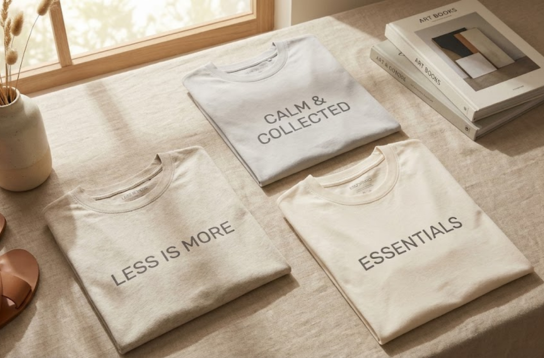
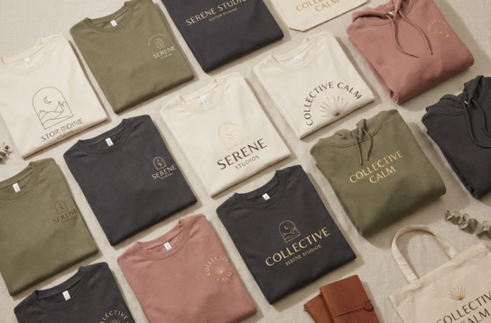
On the other hand, muted tones like sand beige, soft cream, slate gray, and deep charcoal evoke calmness, minimalism, and luxury. These colors pair beautifully with earth-inspired aesthetics and elevate the overall visual impression of your merchandise. They also make typography prints look clean, elegant, and timeless.
Bright colors can attract younger audiences, while neutral palettes create premium appeal. Understanding your target market ensures your color choices speak to the right emotions.
The combination of contrast and harmony also plays a major role. For example, pairing a warm color like #e3ba8a with deep navy or charcoal creates a visually balanced look that feels high-end. When chosen intentionally, colors not only look good—they communicate the identity of your brand.
In merchandise design, color is not just decoration. It’s strategy, emotion, and storytelling woven into one powerful visual language.